← Design Stories
Workflow Design • Eligibility Logic • UX Writing • Mobile-First UI • End-to-End HCD
Design Story Overview
Requesting or replacing a Social Security card sounds simple — but in practice, it’s one of SSA’s most complex eligibility workflows.
Users fall into dozens of categories:
- Newly married / name change
- U.S. citizens or non-citizens
- Newborns applying for their first SSN
- People living abroad
- People experiencing homelessness
- Users without access to original documents
- Those that can file online, must appear in person, or are able to do both
Before this work, SSA’s guidance was difficult to navigate:
- Scattered across many pages
- Written in technical program language
- Lacked a clear starting point
- Hard to use on mobile
- Confusing for users with limited documentation knowledge
The SSN Card Request Tool (affectionately called “the enumeration screener” by internal staff) was designed to simplify the user’s journey, reduce confusion, and guide users step-by-step to the correct instructions for their situation.
I served as a UX strategist, content designer, and flow architect, shaping the logic, UI structure, and plain-language experience behind the tool.
The following sections offer a structured walkthrough of how we translated a dense policy domain into a streamlined digital workflow—covering discovery, logic definition, design, testing, organizational impact, and opportunities for future improvement. Together, they highlight the depth of this work and the systems-level change it enabled.
1. The Call to Solve a Problem - Clarifying User Needs, Pain Points, and the Core Challenge
The original experience had several challenges, users often dealt with:
1a. Highly complex policy
Eligibility rules vary depending on:
- citizenship
- age
- name-change status
- immigration category
- presence of original or certified documents
- location (inside the U.S. vs abroad)
1b. Fragmented guidance creating confusion and stallled applications
SSA’s documentation rules were scattered across inconsistent sources, including:
- help pages created at different times with uneven updates, leaving users unsure which instructions to trust
- outdated FAQs with contradicting rules
- field-office exceptions that never surfaced online
-
“sanitized” internal policy manuals not designed for public use, but shared on the public site in ways that often confused users
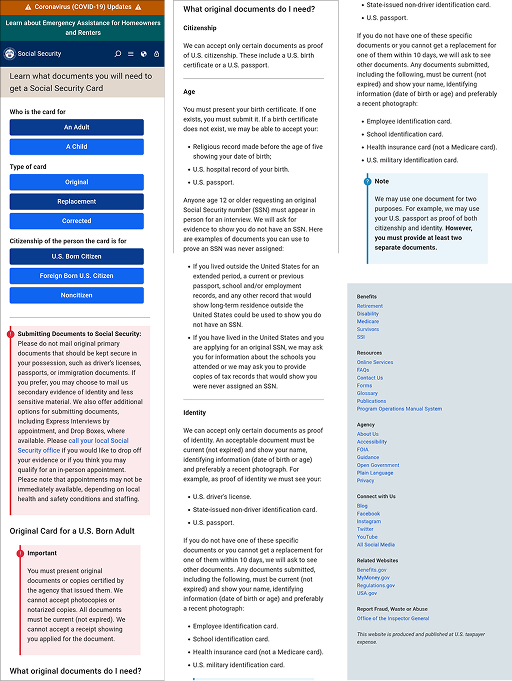
This “before” experience (see Figure 1) tried to answer everyone’s question of “What documents do I need?”—but failed to answer what I, the individual user, needed based on my situation. With generic, conflicting instructions and no clear call to action, users were left uncertain and overwhelmed, a major driver of application errors and repeat office visits.
1c. Broken user journeys that created avoidable strain on staff
Users frequently arrived at field offices:
- without the right documents
- unsure which form they needed
- confused about eligibility
- misdirected for tasks they could do online
1d. High-pressure moments that triggered a stress cycle for users and staff
Most users approached this task with real urgency. They needed a Social Security card so they could:
- start a new job
- enroll a child in school
- complete a housing application
- receive benefits from a third party
That urgency elevated stress, and that stress made an already confusing experience feel even harder to navigate, increasing errors, repeat visits, and frustration. In turn, stressed and confused users put additional pressure on already overworked staff, creating a vicious cycle where unclear guidance amplified stress on both sides of the counter.
We needed an experience that was:
- clear
- mobile-first
- personalized
- low-literacy-friendly
- policy-accurate
- accessible
Figure 1.: Before, users lacked a single, authoritative way to verify the documents they specifically needed.
2. Gathering the Right Team - My Role, Collaboration Approach, and Cross-Functional Partnerships
Role: UX Strategist / Content Designer
I led or co-led:
- Mapping the full decision logic
- Translating policy into user-friendly questions
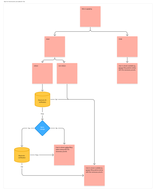
- Designing wireframes and multi-step flows (See Figure 2)
- Creating mobile-first UI patterns
- Writing eligibility and result content
- Ensuring design system and accessibility alignment
- Collaborating closely with policy SMEs and operations teams
Core collaborators:
- Policy experts (SSN/Enumeration)
- UX researchers
- Front-end developers
- Spanish-language reviewers
- Field office SMEs
- Accessibility and design system contributors
Figure 2: High-level visualization of the user’s Social Security card application flow.
3. Navigating the Design Journey - End-to-End UX Process: Discovery, IA, Content Strategy, Prototyping, and Testing
3a. Discovery & Research
We identified:
- the top reasons people request an SSN card
- the biggest user misunderstandings
- the most common failure points in eligibility flows
Research methods:
- Analytics review (search queries, task funnels)
- Interviews with field office staff
- Review of call-center logs
- Assessment of common user error cases
- Spanish-language comprehension feedback
- Comparative analysis of decision tools (DMV, USCIS, GOV.UK)
Key insights:
- Users misunderstood what “original documents” meant
- Name-change workflows were deeply confusing
- Non-citizen pathways were unclear
- Living-abroad rules were hidden or inconsistent
- Users felt overwhelmed by dense information
- Child-focused workflows needed to balance clear guidance for minors with strict compliance to federal (COPPA/CIPA) regulations.
3b. Defining Logic & Requirements
Designing this tool required untangling every possible scenario a user might fall into.
Eligibility for a Social Security card depends on a wide range of factors, including:
- reason for the request
- citizenship or immigration status
- location (inside the U.S., abroad, or transient)
- documentation availability
- third-party or parental filing rules
- state laws governing electronic disclosure
- special exceptions and edge cases
Early analysis showed that the existing logic was either nonexistent or written for program administrators—not for the public. To create a clearer, more navigable experience, we reframed the decision points around user-centered questions, presented in a natural order that aligned with real mental models.
The core structure of the redesigned logic
I. Who are you filing for?
Understanding whether the user is acting for themselves, a minor child, or someone else determines eligibility and what authority or documentation they must present.
II. Why do you need a card?
Different scenarios—name changes, newly naturalized citizens, recently adopted children, and users without traditional ID—trigger different evidence requirements.
III. Where are you located?
Users living abroad, unhoused individuals, and those in states that permit electronic disclosure each require distinct workflows and instructions.
IV. What documents do you have today?
Users often misunderstand “original” versus “certified” documents. Asking early about what they possess helps route them into the correct evidence path.
V. What else applies to your situation?
Additional conditions—such as age, recent immigration status changes, or special exceptions—further refine the path and ensure accuracy.
By restructuring the program’s dense, rule-based logic into straightforward, sequential questions, we created a streamlined decision-tree architecture that users could navigate one step at a time without needing to understand the underlying policy.
3c. Design & Prototyping (Figma)
Deliverables I created:
- Wireframes for each decision step
- Mobile-first UI patterns
- Question and answer structures
- Document explainer components
- Results-page layout and content
- Reusable components integrated with the design system
UX principles used:
- One question per screen
- Plain language
- Contextual help for documents
- Progressive disclosure
- Error prevention through clarity
- WCAG AA+ accessibility
3d. Testing & Iteration
We used:
- Moderated usability sessions
- Comprehension testing
- Spanish-language QA
- Accessibility reviews
- Policy accuracy checks
- Error-case walkthroughs
Improvements made:
- Simplified question wording
- Reordered steps based on user mental models
- Added clearer document descriptions
- Strengthened final next steps “Pause Point” instructions
- Improved readability and scannability
- Ensured parity across English and Spanish
Testing confirmed major increases in clarity and task confidence.
3e. Delivery & Collaboration
I collaborated with:
- Developers (to convert logic to code)
- Spanish reviewers (for linguistic parity)
- Policy teams (for accuracy)
- Operations teams (to confirm office readiness)
We aligned on:
- Valid eligibility pathing
- Content logic
- Error-handling rules
- UI patterns
- Launch timing and review cycles
4. Reaching the Breakthrough Moments - Key Insights, Usability Findings, Decisions, and Iterations
Clarity & comprehension
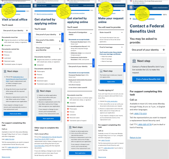
I crafted the copy to match the terminology field offices use every day, ensuring users and staff were finally speaking the same language. (See Figure 4)
- Significant reduction in comprehension errors
- Spanish-language comprehension improved due to rewritten structures
- Name-change confusion dropped from ~60% → ~15% in testing
Operational impact
- Fewer misdirected field office visits
- Better-prepared users (correct documents on first attempt)
- Reduced documentation confusion
- Decreased “What do I need to bring?” call volume
User empowerment
Users reported:
- “finally knowing what I actually need”
- “feeling less stressed”
- “understanding what applies to me”
Figure4: Examples of “Pause Points”: strategically placed, user-specific prompts that increase the likelihood of resolving tasks during the initial interaction.
5. Ripples Across the Organization - Outcomes, Impact Metrics, and Alignment to Agency Priorities
The SSN Card Request Tool was designed to help individuals understand a complex, high-stakes process — but its effects reached far beyond the user interface. It created measurable improvements across multiple layers of SSA’s service delivery ecosystem.
Measurable Outcomes
Increased comprehension and reduced errors
- Name-change workflow confusion dropped from ~60% to ~15% in usability testing.
- Users’ ability to correctly identify required documents increased significantly across both English and Spanish flows.
- Participants reported a noticeable increase in confidence and clarity during testing.
Lower operational burden on frontline staff
- Field office staff faced fewer “wrong form” and “wrong document” cases.
- Fewer users arrived unprepared, reducing interview time and rework.
- Call-center agents reported fewer clarification calls about documentation requirements (based on anecdotal feedback and call-pattern sampling).
Stronger alignment with accessibility & language access goals
- The tool established a parallel, structurally consistent English/Spanish experience.
- Simplified question wording and one-step-at-a-time design improved performance for:
- users with low literacy
- users on mobile devices
- users with cognitive load challenges
- Content was written to support WCAG AA+ guidance and SSA’s internal Plain Language standards.
Organizational Impact
Clearer pathways reduced friction across multiple components
The streamlined eligibility logic helped program, policy, and operations teams speak a shared language. By centralizing and simplifying rules, the tool reduced cross-component discrepancies and improved internal consistency.
Field offices and operations benefited directly
Frontline employees frequently noted:
- fewer documentation corrections
- fewer repeat visits
- less time spent clarifying confusing or outdated instructions
These improvements strengthened SSA’s capacity to process workloads accurately and efficiently.
Repeatable patterns for future workflow redesigns
This project laid the groundwork for:
- reusable content patterns
- eligibility logic templates
- question/answer scaffolds
- component-aligned UI structures
These assets were later referenced in discussions about improving other workflows (e.g., proof of identity, benefit eligibility steps).
Alignment to Agency Priorities
Supporting SSA’s digital-first strategy
The tool directly advanced SSA’s goal of shifting more services online by:
- increasing user comprehension
- reducing avoidable office visits
- guiding users into the correct digital pathways
- aligning with Web Strategy’s multi-year modernization roadmap
Reinforcing commitments under Section 508 and Executive Orders on customer experience
The guided, mobile-first flow supported government-wide directives on:
- accessibility
- plain language
- digital equity
- improved CX for high-impact public-facing services
Strengthening the foundation for end-to-end modernization
While this work focused on the public, non-secure portion of the card-request experience, it created momentum to explore improvements in:
- the secure (post-sign-in) experience
- document submission tasks
- status checking
- downstream verification workflows
This positioned the Enumeration domain for future transformation aligned with broader SSA modernization priorities.
The Broader Ripple
The SSN Card Request Tool demonstrates how targeted workflow improvements can reduce burden not only for the public, but also for SSA’s systems, staff, and service infrastructure. It’s a clear example of how thoughtful design creates ripple effects across operations, policy alignment, user satisfaction, and organizational performance.
6. Reflections and Future Direction - Summary, Lessons Learned, and Opportunities for Continued Improvement
Designing the SSN Card Request Tool reinforced a core lesson: even the most complex, policy-heavy workflows can be made clearer, more humane, and more navigable when we center real user needs and structure logic around their mental models rather than program rules.
What I Learned
- Policy translation requires empathy. The more complex the rule set, the more important it becomes to reframe requirements in language people can understand quickly—especially under stress.
- One-question-per-screen works. Breaking dense instructions into a guided, mobile-first flow dramatically improves comprehension and reduces errors.
- Cross-functional alignment is critical. Policy experts, developers, and operations staff each held essential pieces. The strongest solutions emerged when these perspectives converged early.
- Spanish-language parity is its own design discipline. Parallel testing revealed that structural clarity—not just translation quality—had a significant impact on Spanish-language usability.
Opportunities for Continued Improvement
Although we made substantial progress in simplifying the eligibility journey, several important opportunities remain:
-
Extend the experience into the secure (post-sign-in) environment.
Our iterative work focused on the public, non-secure side of the workflow. The secure experience—where users submit documents, check status, or track requests—still presents opportunities for clearer language, fewer dead ends, and better task continuity.
-
Unify guidance end-to-end.
The eligibility flow upstream is now clear, but downstream steps (e.g., uploading documents, updating personal information, checking application outcomes) could benefit from the same design patterns and plain-language approach.
-
Provide real-time “document readiness” guidance.
Many frustrations occur when users discover too late that they don’t have acceptable documents. Adding proactive checks or document previews could further reduce field office visits.
-
Create a more personalized journey based on known user data.
When users sign in, SSA already knows age, citizenship status, benefit status, and in some cases name-change flags. Tailoring questions based on this data would shorten the flow dramatically.
-
Expand testing to include users with additional access needs.
While we ensured WCAG compliance, deeper research with screen-reader users and people with cognitive load challenges would reveal further opportunities to simplify decision points.
Final Reflection
This project highlighted how impactful workflow design can be when grounded in research, collaboration, and iterative refinement. There is meaningful room to extend this approach across the full enumeration lifecycle—and I’m excited by the prospect of continuing this type of work where complex services need clarity and structure.
← Design Stories