← Design Stories
SSA.gov Mobile-First Redesign
Enterprise Web • Human-Centered Design • Task-Centered UX • Accessibility & Spanish-Language Equity
Design Story Overview
SSA.gov serves more than 180 million visitors a year, making it one of the most heavily used public-service websites in the United States. When I joined Web Strategy as a Content Strategist and UX lead, the site was struggling with:
- fragmented content across more than 78,000 pages
- outdated templates and inconsistent design patterns
- low customer satisfaction (CSAT ~47.7)
- page-centric structures instead of task-centric journeys
- poor mobile usability
- uneven Spanish parity across high-impact content
- growing demand for online services after the pandemic closed field offices
The goal of the Digital-First Redesign was to transition SSA from a field-office-first service model to an online-first, scalable digital ecosystem. We aimed to modernize high-impact user journeys across the site by:
- streamlining top tasks,
- improving accessibility,
- strengthening Spanish-language equity, and
- establishing a cohesive enterprise design system rooted in usability and evidence.
What follows is the story of how we re-centered SSA.gov around user needs and modern web practices—ultimately increasing CSAT to 70.0, improving online service adoption, and laying the foundation for sustainable enterprise-wide digital governance.
To show how this came together end-to-end, the following six sections walk through the core challenge, the team, the UX process, the key insights that shaped the redesign, the organization-wide impact, and the plan for what comes next.
1. The Call to Solve a Problem - Clarifying User Needs, Pain Points, and the Core Challenge
Before the redesign, the SSA.gov experience was shaped more by program structures than by how people actually searched, navigated, or completed tasks online. Our early research surfaced a consistent pattern:
Users weren’t Googling “programs”—they were searching for solutions.
(“Apply for retirement,” “Get a card,” “Verify my benefits,” “Check a payment.”)
Where the experience broke down
Across analytics, Medallia feedback, field office insights, and Spanish-language testing, we saw:
- Dense, outdated content that overwhelmed users before they began
- Program pages that buried core tasks beneath layers of definitions
- Mobile layouts that made long pages nearly impossible to scan
- Inconsistent content patterns across English and Spanish versions
- High drop-off on pages that required multi-step understanding
- Users defaulting to phone or field office visits even when digital options were available
The core challenge
We needed to transform SSA.gov into a task-centered, mobile-first, research-informed experience that:
- made high-impact tasks obvious and easy to begin
- provided clear, plain language that matched user expectations
- ensured Spanish-language structural parity
- aligned with accessibility, UX best practices, and federal CX mandates
- reduced burden on call centers and field offices
- created a system of reusable components to scale change
This was not a page redesign—it was a structural and cultural shift.
2. Gathering the Right Team - My Role, Collaboration Approach, and Cross-Functional Partnerships
My Role: Content Strategist & UX Lead
I served as a core strategist on the redesign team, responsible for:
- co-leading content strategy for high-traffic tasks (retirement, SSI, disability, Medicare, card services)
- building and governing the SSA Design System in Figma aligned with USWDS
- redesigning task-focused page templates and flows
- partnering with researchers to analyze Medallia, DAP/GA, and usability testing
- overseeing structural parity and quality across English and Spanish content
- facilitating alignment across policy, operations, dev, and communications
- founding the Digital Experience Council for governance and standards
The team behind the work
This was a deeply cross-functional initiative involving:
- UX designers and researchers
- Web and WCMS developers
- USDS and GSA design partners
- Program and policy SMEs
- Accessibility specialists
- Spanish-language reviewers
- Data and analytics teams
- SSA’s Office of Communications and executive-level stakeholders
Collaboration strategy
To keep alignment across such a large and distributed environment, I:
- facilitated weekly working sessions with components and SMEs
- led design system governance reviews
- maintained Confluence documentation for patterns, taxonomies, and templates
- collaborated with devs to ensure design intent was preserved
- supported proposal writing for the Technology Modernization Fund and internal modernization efforts
- partnered with researchers on Spanish-language testing and eye-tracking reviews
We worked in Agile cycles, delivering improvements in measurable increments rather than waiting for a “big bang” relaunch.
Figure 2: Rather than a one-time major overhaul, we adopted Agile methodology to implement incremental enhancements.
3. Navigating the Design Journey - End-to-End UX Process: Discovery, IA, Content Strategy, Prototyping, and Testing
3a. Discovery & Research
Our North Star was evidence. We combined:
Quantitative insights
- Medallia CSAT scores and user verbatims
- High-level DAP/Google Analytics patterns
- Search logs showing user intent
- Device breakdowns revealing extremely high mobile usage
- Pathing and drop-offs across top-task pages
Qualitative insights
- Moderated usability testing across both English and Spanish
- Accessibility walkthroughs and screen reader testing
- Field office interviews revealing common misconceptions
- SME feedback identifying program complexities
- Heuristic evaluations of page patterns
Key findings
- Users consistently looked for actions, not program names.
- Dense walls of text led to high abandonment and confusion.
- Spanish users often lacked access to structured parity or plain-language equivalents.
- Mobile users struggled with long scrolls, unclear CTAs, and low scannability.
- There was massive duplication of instuctions making navigation unpredictable and inconsistent.
These findings, shown in Figure 3a, led us to a unified, top-task IA strategy.
Figure 3a: Examples from usability testing and observation sessions that informed top-task prioritization and content restructuring.
3b. Top-Task IA & Content Strategy
We built a new IA (Figure 3b) that centered on the most common user needs, which accounted for the majority of traffic:
- Apply for benefits (retirement, disability, SSI, Medicare)
- Get/replace a Social Security card
- Request a letter showing proof/verification of benefits
- Check payment status
- Understand eligibility
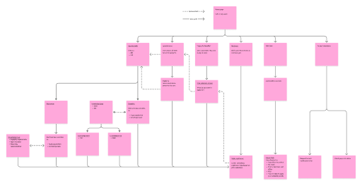
Figure 3b: Example of high-level IA consolidation showing streamlined top-task pathways.
Content strategy pillars
- Plain language at a 4th–6th grade reading level
- Task-first intros that answered “What do I need to do?” immediately
- Step-by-step structures to reduce cognitive load
- Reorganized eligibility sections
- Shared content patterns for consistency
- Spanish-language parity baked in from the start
This set the foundation for the design system.
3c. Design System & Prototyping
As part of the redesign, I helped build and maintain the SSA Design System in Figma:
- Components aligned with USWDS
- Templates for landing pages, task pages, workflows, and informational content
- Shared typography, spacing, and interaction standards
- Reusable content structures (FAQs, steps, eligibility blocks, alerts)
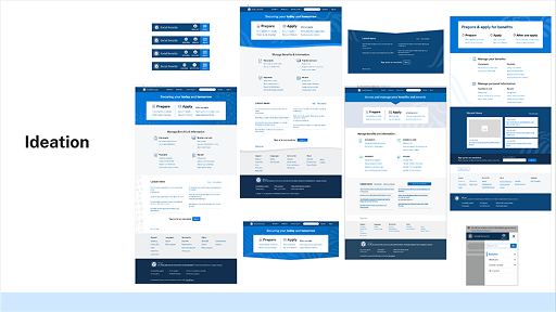
Figure 3c: Wireframes for redesigned top-task landing page.
Prototyping focus
- Mobile-first layouts
- Clear CTA hierarchy
- Structured content blocks
- Spanish + English design parity
- Progressive disclosure for complex details
3d. Testing & Iteration
We conducted:
- Moderated usability testing
- Comprehension checks for plain language
- A/B comparisons on headings, CTA labels, alert styles
- Spanish-language testing
- Accessibility review with screen readers and keyboard navigation
Iterative improvements included:
- Better chunking of large content blocks
- Updated CTAs to more actionable phrasing
- Rewritten long-form paragraphs
- Standardized Spanish-language structures
- Improved mobile tap targets and spacing
4. Reaching the Breakthrough Moments - Key Insights, Usability Findings, Decisions, and Iterations
Breakthrough #1: Users wanted tasks, not programs
Switching from program-focused pages to task-focused landing pages significantly improved findability and comprehension.
Breakthrough #2: Spanish parity required structural redesign
Spanish content outperformed expectations, regularly scoring 85%+ CSAT, after introducing structural parity and clearer translation workflows.
Simplifying long, policy-heavy text into short, scannable statements directly correlated with higher task completion rates.
Breakthrough #4: Consistent design patterns mattered
The design system reduced fragmentation, guided new content creation, and enabled faster iteration across teams.
Breakthrough #5: User confidence increased dramatically
CSAT rising from 47.7 → 70.0 aligned directly with a redesigned experience that felt simpler, more predictable, and more trustworthy.
5. Ripples Across the Organization - Outcomes, Impact Metrics, and Alignment to Agency Priorities
The redesign’s impact rippled far beyond the pages themselves.
Measurable Outcomes
- CSAT: 47.7 → 70.0 (+22.3)
- Spanish-language pages: 85%+ CSAT
- SSI page performance: 76.5 CSAT
- Online Benefit Verification requests: +550% increase
- my Social Security digital transactions: +25% increase
- Reduced misdirected office visits and call-center burden
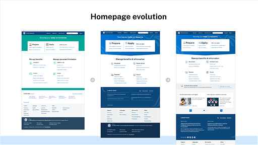
Figure 5: Web and mobile wesite design.
Organizational Alignment
- Supported the agency’s Digital-First Strategy
- Advanced Executive Orders on Customer Experience
- Strengthened compliance with plain language, accessibility, and digital equity
- Enabled scalable modernization efforts across components
Recognition & Validation
This work contributed to:
- Deputy Commissioner’s Citation (2024)
- Service to the Citizen Award (2023)
- ClearMark Award Finalist (2023)
- Multiple performance and time-off awards
6. Reflections and Future Direction - Summary, Lessons Learned, and Opportunities for Continued Improvement
What I Learned
- System-wide change requires strong governance and shared patterns.
- Spanish-language parity must be a first-class design requirement.
- Task-centered thinking can cut through long-standing organizational silos.
- Data-driven iteration is essential—analytics and plain language go hand in hand.
Opportunities Ahead
- Extend redesign principles deeper into secure/signed-in experiences.
- Improve omnichannel consistency across digital, phone, and office touchpoints.
- Introduce personalization for signed-in users where appropriate.
- Expand targeted research for people with additional access needs.
- Continue consolidating legacy content into reusable, predictable patterns.
Final Reflection
The SSA.gov Mobile-First Redesign proves that a complex federal website can become clearer, more human, and more efficient through thoughtful design. It laid a foundation for long-term modernization—one that centers user needs, elevates accessibility, and supports millions of people in moments that matter.
← Design Stories