← Design Stories
#DTPS Workload Tracker MVP
Design Story Overview
When I joined the Division of Training and Program Support (DTPS) as a Program Expert, I stepped into an environment filled with smart, committed people — but the “experience layer” of our work was almost entirely invisible.
Management Program Analysts (MPAs), Program Experts (PEs), and leadership were juggling dozens of program workloads with no shared architecture, no consistent workflow patterns, and no central way to see how work moved through the system. Knowledge lived in inboxes, memory, and ad-hoc documents.
This created friction, rework, and a lack of clarity that slowed us down when our mission demanded precision, consistency, and transparency.
My goal was to bring human-centered design, product thinking, and systems clarity to DTPS by creating the foundation for an Internal Experience Platform — a scalable structure for how workloads are researched, documented, executed, and tracked.
The first major artifact of this platform is the DTPS Workload Tracker MVP, a tool that brings visibility, consistency, and shared understanding across the branch.
Throughout this work, I am applying the same principles I used in my prior SSA-wide transformation efforts — including the redesign of SSA.gov, the creation of agency-wide design systems, and cross-component governance. This approach also aligns closely with the expectations of a Product Design Lead, including setting vision, defining systems, leading through ambiguity, and delivering usable tools that scale.
1. The Call to Solve a Problem — Clarifying User Needs, Pain Points, and the Core Challenge
From day one, it was clear that DTPS operated within a fragmented ecosystem:
- Each workload moved differently depending on who handled it
- There were no shared workflow patterns or standards
- Leadership lacked real-time visibility into progress
- MPAs had no clear blueprint for documenting or updating processes
- Cross-agency interactions (e.g., with OPM) suffered from inconsistent communication
- Institutional knowledge lived in people’s heads rather than in a structured system
The core challenge wasn’t just “tracking workloads.”
It was creating clarity — a transparent, consistent, human-centered structure for how DTPS works.
This required:
- Designing a repeatable workflow architecture
- Establishing governance rules and documentation standards
- Building a scalable information backbone
- Creating a usable tool for day-to-day execution
- Aligning analysts, leadership, and external partners
In short:
We needed to transform a loosely connected set of tasks into a cohesive product ecosystem.
Figure 1: Varied and inconsistent reports make it harder to process information efficiently.
2. Gathering the Right Team — My Role, Collaboration Approach, and Cross-Functional Partnerships
Although DTPS is not traditionally structured like a product team, I approached this work as a cross-functional design initiative.
My Role
- Product design lead for internal workflows
- UX strategist and systems thinker
- Researcher, facilitator, and prototype builder
- Source of clarity in ambiguous problem spaces
- Connector between analysts, leadership, and partner components
Collaboration Approach
I built momentum through:
- 1:1 discovery conversations with MPAs
- Shadowing workload execution to observe real behaviors
- Weekly check-ins with leadership to validate approaches
- Joint working sessions to define terminology and standards
- Coordinating with the Data Exchange team on cross-agency communication needs
- Testing prototypes with the people who would use them daily
Cross-Functional Partnerships
My collaborators included:
- MPAs and PEs — primary users and domain experts
- Branch leadership — business owners and decision makers
- Data Exchange team — critical for SSA & OPM interactions
- Training & quality staff — ensuring processes were repeatable
- IT partners (advisory) — validating long-term scalability
This model mirrors the product team structures I worked with during the SSA.gov redesign — designers, developers, policy, and content strategists working in lockstep.
3. Navigating the Design Journey — End-to-End UX Process
3a. Research & Insights
I began by conducting qualitative discovery, including interviews, shadowing, and artifact reviews.
Key insights emerged:
- Workloads lacked standardized entry and exit points
- MPAs interpreted responsibilities differently
- Leadership lacked a single source of truth (See Figure 3a)
- Prior attempts at documentation were inconsistent or siloed
- Cross-agency tasks (especially involving OPM) suffered from fragmented communication
These findings made the problem clear:
Without shared patterns, everything becomes custom work.
Figure 3a: A flow showing the convolution of requesting task reports before the dashboard was established.
3b. Definition & Alignment
With insights documented, I led DTPS through structured alignment sessions to define:
- What a “workflow” means in DTPS
- A shared taxonomy (steps, decision points, roles, dependencies)
- Documentation standards
- Visibility expectations for leadership
- When and how updates are triggered
- Patterns that should repeat across all workflows
This culminated in a guiding framework used to evaluate all processes moving forward.
3c. Design & Iteration
Once the foundational architecture was defined, I moved into design mode.
Core Workflow Foundations
I fully researched, documented, and leadership-vetted the first five workflows — establishing patterns that scale.
Program Expert BPD & SOP
I co-authored the first Business Process Document and Standard Operating Procedure, which act as our design system for internal operations:
- reusable components
- standardized documentation
- clear naming conventions
- consistent decision-making structures
- governance rules for updating processes
Workload Tracker MVP
To create real visibility, I designed the Workload Intelligence Dashboard, an MVP that:
- consolidates progress across workflows
- enables MPAs to enter updates in a structured way
- provides leadership with real-time status
- identifies bottlenecks before they become problems
- lays the groundwork for future automation
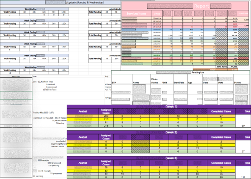
Figure 3c: Early MVP prototype showing 2 of the workloads available in the dashboard.
3d. Testing & Validation
I validated the design through:
- Hands-on walkthroughs with MPAs
- Leadership review sessions
- Cross-team feedback loops
- Iterative refinements based on real use cases
Feedback confirmed that the system:
- reduced confusion
- increased efficiency
- clarified responsibilities
- made leadership oversight easier and more consistent
4. Reaching the Breakthrough Moments — Key Insights, Usability Findings, Decisions, and Iterations
Several breakthrough decisions shaped the final design:
1. Patterns; Not Pages
Users didn’t need long documents — they needed repeatable structures.
This led to reusable workflow templates, decision models, and naming conventions.
2. Visibility Must Be Centralized
The dashboard became the centerpiece of the platform because users needed real-time clarity.
3. Communication with OPM Required Redesign
The standardized routing slip:
- reduced rework
- aligned multiple teams
- improved collaboration between SSA and OPM
- reinforced the need for structured communication patterns
4. “Just Enough Structure” Was Key
People didn’t want bureaucracy — they wanted clarity.
The system balanced structure with usability.
5. Ripples Across the Organization — Outcomes, Impact Metrics, and Alignment to Agency Priorities
Though early-phase, this work has already had meaningful impact:
Operational Outcomes
- Clear, repeatable workflows for the first time
- A shared mental model used across DTPS
- Reduced ambiguity and fewer one-off questions
- Structured communication with OPM
- A dashboard that gives leadership meaningful visibility
User Outcomes
- Leadership has a centralized on-demand access to reports
- MPAs understand exactly how to execute and document work
- PEs can quickly review and validate tasks
- New staff have a clearer onboarding experience
Organizational Outcomes
This work supports key SSA strategic priorities, including:
- Improving operational efficiency
- Reducing errors and rework
- Strengthening cross-component collaboration
- Increasing transparency and accountability
These outcomes mirror the measurable improvements I achieved during the SSA.gov redesign — including +22.3 CSAT, clearer pathways, and cross-agency alignment — and reflect the competencies expected from a Product Design Lead role.
6. Reflections and Future Direction — Summary, Lessons Learned, and Opportunities for Continued Improvement
DTPS needed clarity, structure, and cohesion — and the early phases of this work are delivering exactly that.
What I learned
- Service design inside an organization is just as critical as what we deliver to the public
- People crave clarity and consistency
- Systems thinking is essential in operational environments
- Good internal tools reduce cognitive load and align teams
- Governance and patterns matter as much as documentation
What’s next
- Expanding the workflow library using the established architecture
- Refining the dashboard with real-time automation
- Strengthening cross-agency communication patterns
- Building a full internal Experience Platform that scales across DTPS
Throughout this project, I’ve applied the same principles that guided my work on SSA.gov — human-centered design, content clarity, accessibility, systems thinking, and measurable impact.
This story reflects the leadership, strategy, and experience design competencies I bring to Product Design Lead roles.
← Design Stories